My favorite app
Great app, easy to use. Helps our small business save time and money to create different marketing materials professionally. Thank you.
Start by uploading an image of your data, like a spreadsheet, a report table, or an existing chart you want to recreate.
In the prompt box, tell the AI how to visualize your data. For example, 'Create a bar chart comparing solar and wind energy production.'
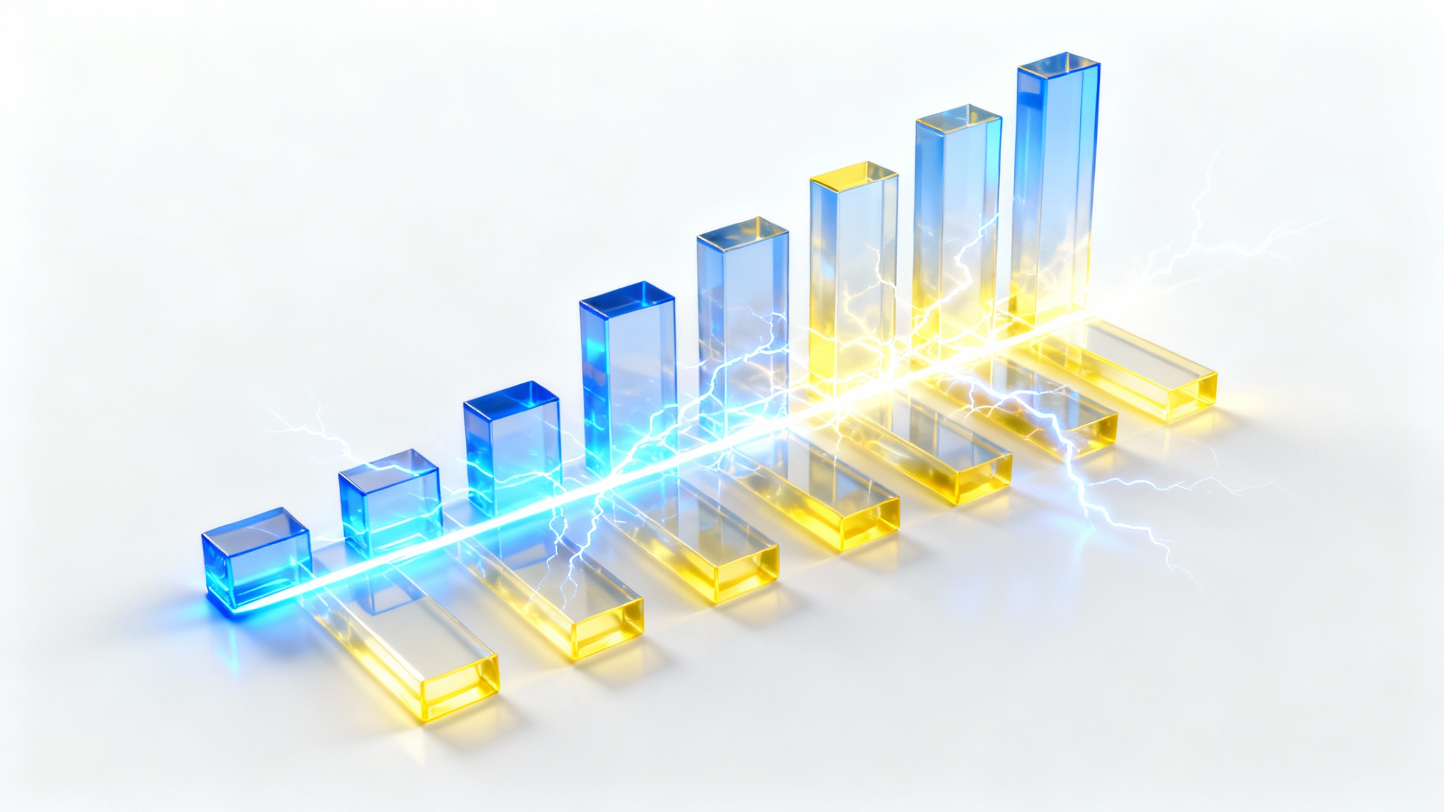
With one click, the AI will analyze your data and prompt to generate a custom bar chart for you in seconds.
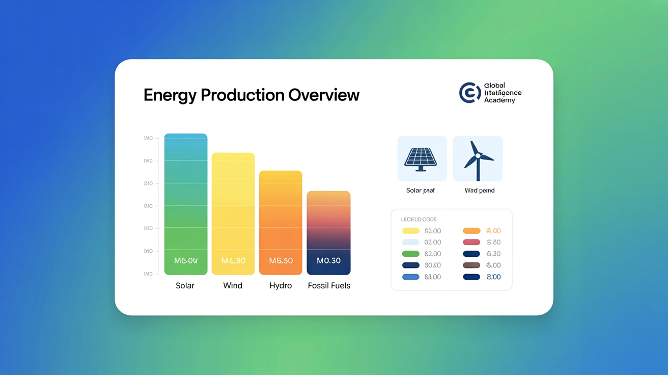
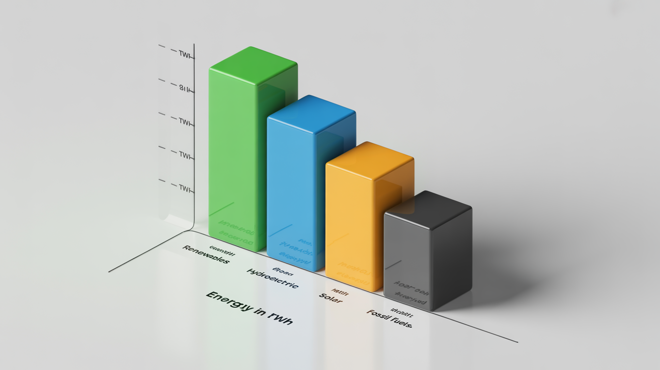
Your high-resolution energy bar chart is ready. Download it as a PNG or JPG to use in your presentations, reports, or online content.
An AI energy bar chart generator is a tool that uses artificial intelligence to automatically create bar charts from your data. You can upload an image of your data and provide a text prompt to describe how you want the chart to look, including colors, labels, and style, and the AI will generate the visual for you.
You can start by uploading an image containing your data, such as a screenshot of a spreadsheet, a table in a document, or even a picture of a hand-drawn chart. The AI will interpret the data and your text prompt to build the final visualization.
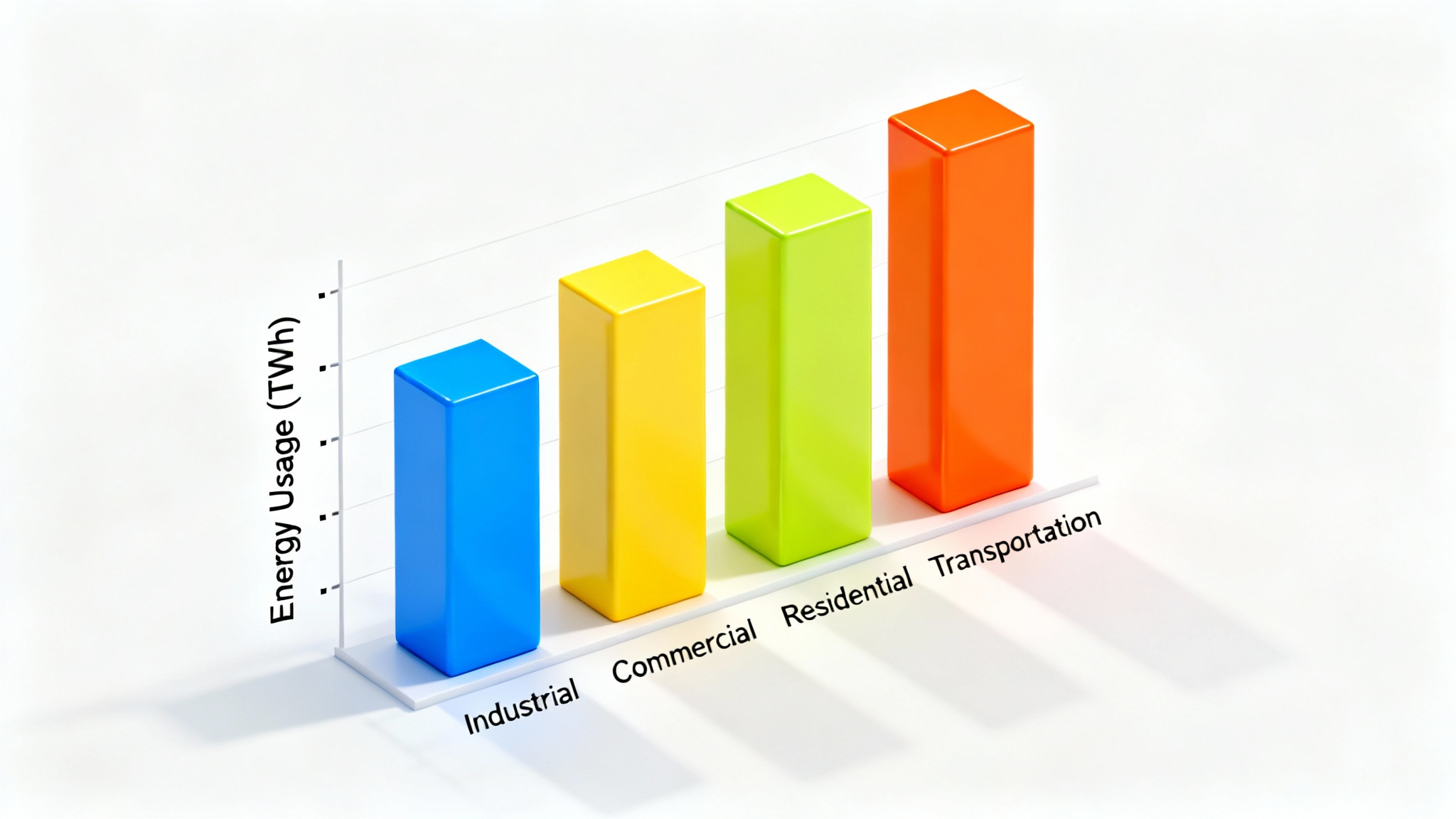
You can customize your chart by using descriptive text prompts. Specify what you want to change, such as 'make the bar for solar energy green,' 'add a title that says Energy Production Overview,' or 'use a dark background.' The more detailed your prompt, the more tailored the result will be.
Yes, our tool is perfect for comparison. You can easily create a bar chart that displays the values for multiple energy sources like solar, wind, hydro, and fossil fuels side-by-side, making it simple to compare their production or consumption levels.
Yes, you can create and download high-resolution bar charts for free in PNG or JPG format. All downloads are watermark-free and can be used for personal or commercial projects.
Not at all. The tool is designed to be user-friendly for everyone, regardless of technical skill. If you can write a sentence describing what you want, you can create a professional-looking bar chart.
Great app, easy to use. Helps our small business save time and money to create different marketing materials professionally. Thank you.
I need a good background remover for my work and I've been through them all it feels like. This one is the best by far. It's so easy to use and the results always look amazing. Thank you Pixelcut!
It's amazingly easy and gives the perfect results for my bags and accessories. It looks like it was done by a professional photographer.