私のお気に入りのアプリ
素晴らしいアプリ、使いやすい。中小企業がさまざまなマーケティング資料を専門的に作成するための時間と費用を節約できるようになります。ありがとう。
Start by writing a prompt that details your ideal admin dashboard. Include the purpose, data elements, and style. For example, 'A clean dashboard for an e-commerce site with sales charts and a recent orders list'.
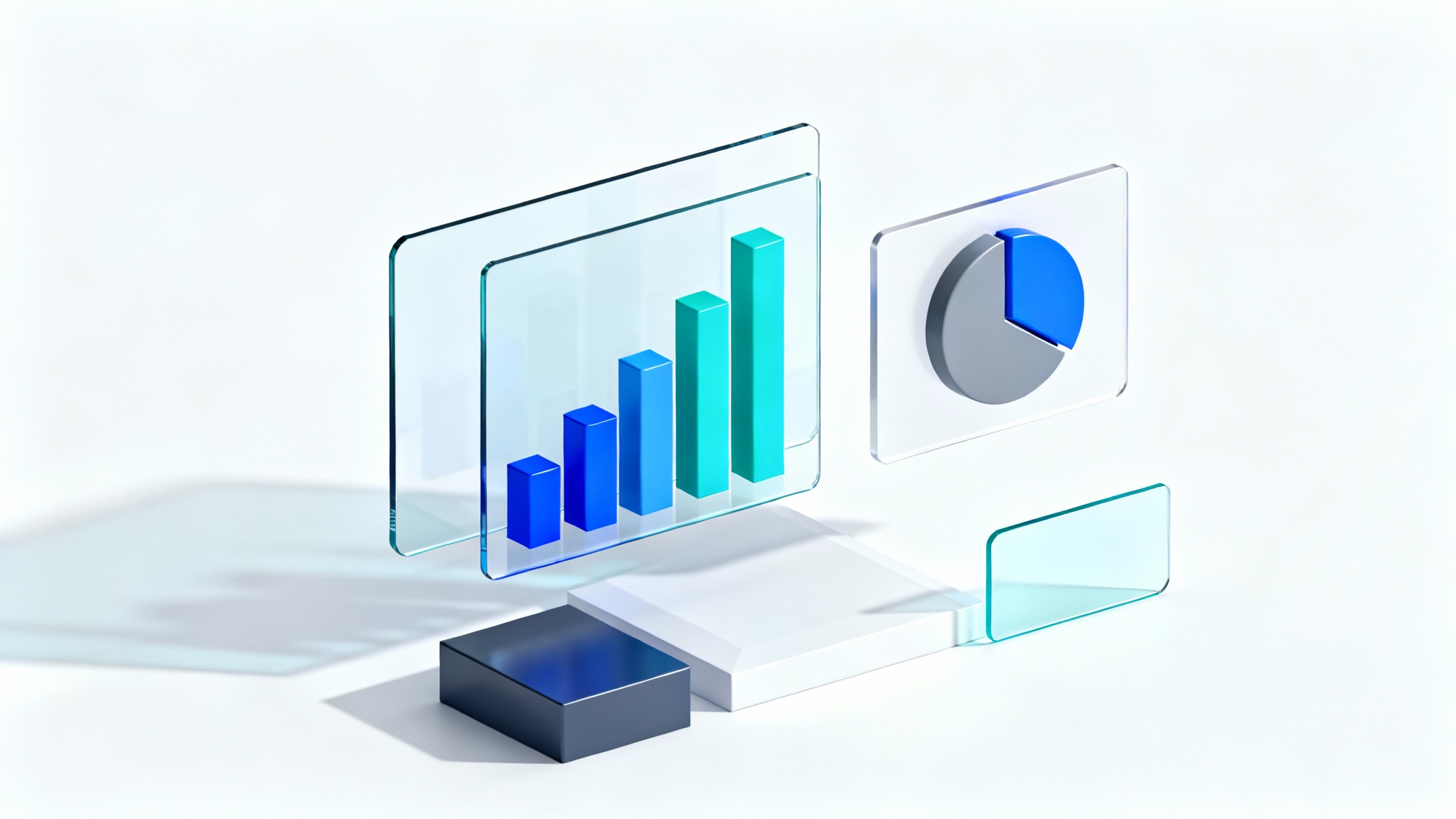
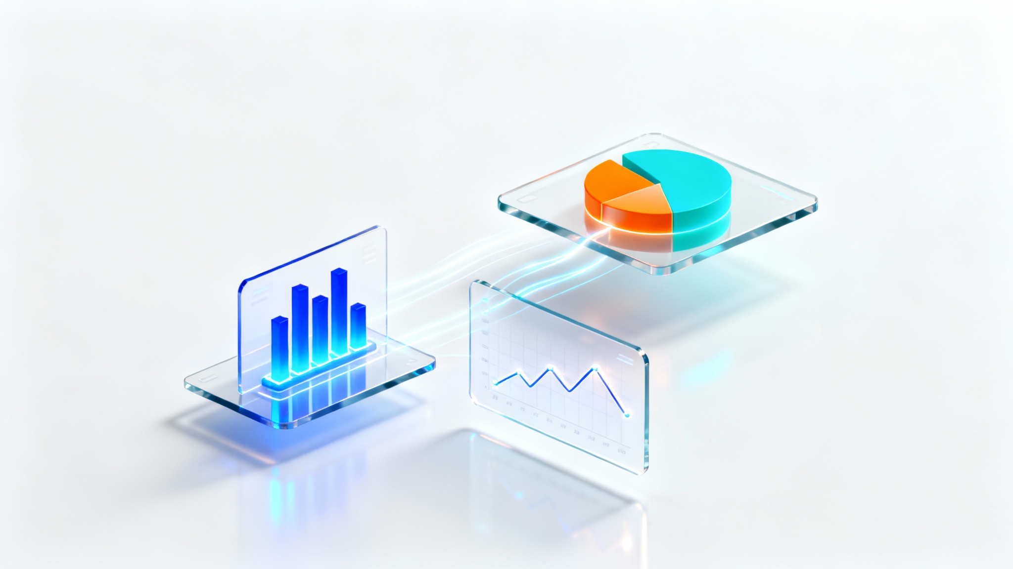
Click the generate button and let our AI interpret your prompt. It will create a unique dashboard UI mockup tailored to your description, incorporating best practices for layout and data visualization.
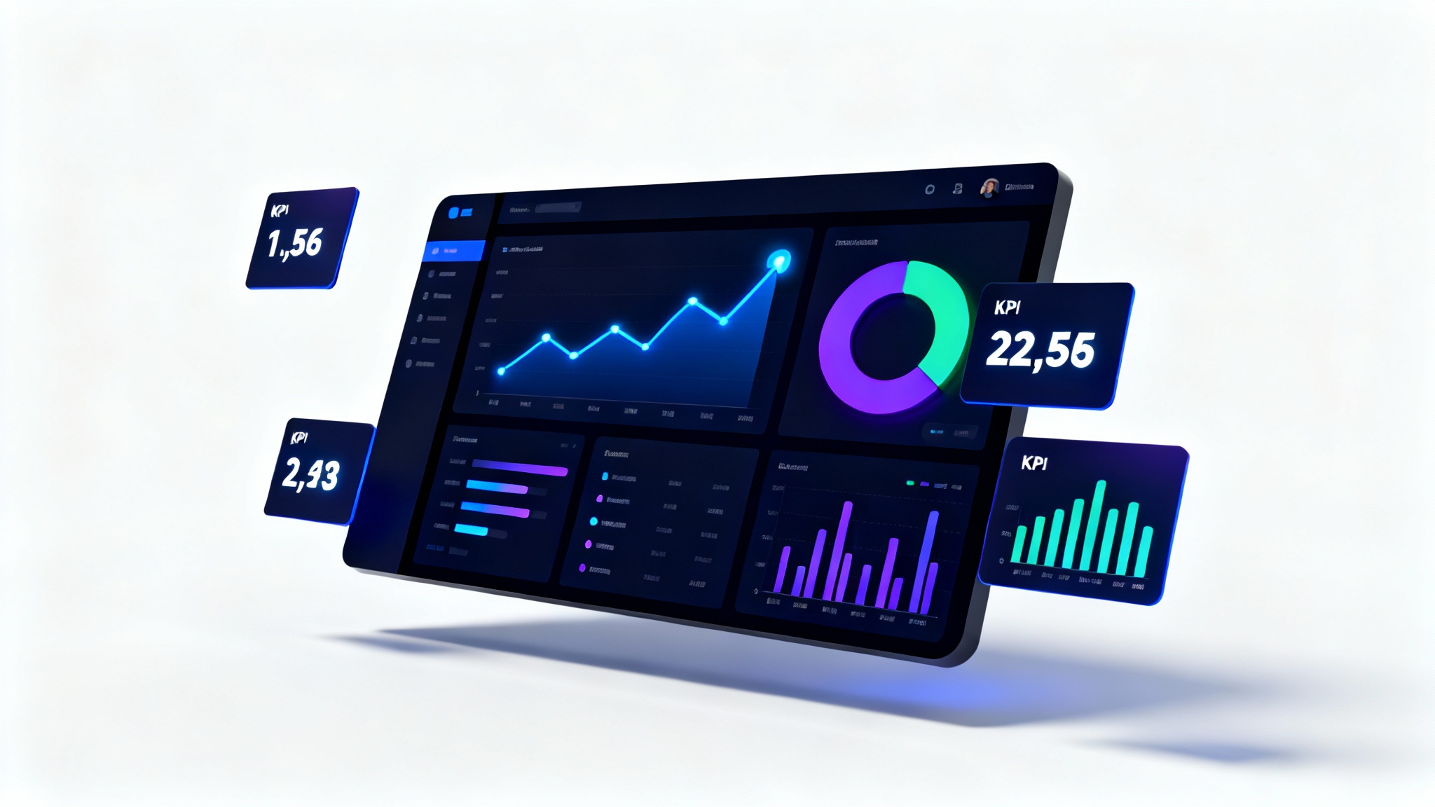
Your AI-generated admin dashboard design is ready to download. Use this high-resolution image as a reference for your UI/UX team, a guide for developers, or to get feedback from stakeholders.
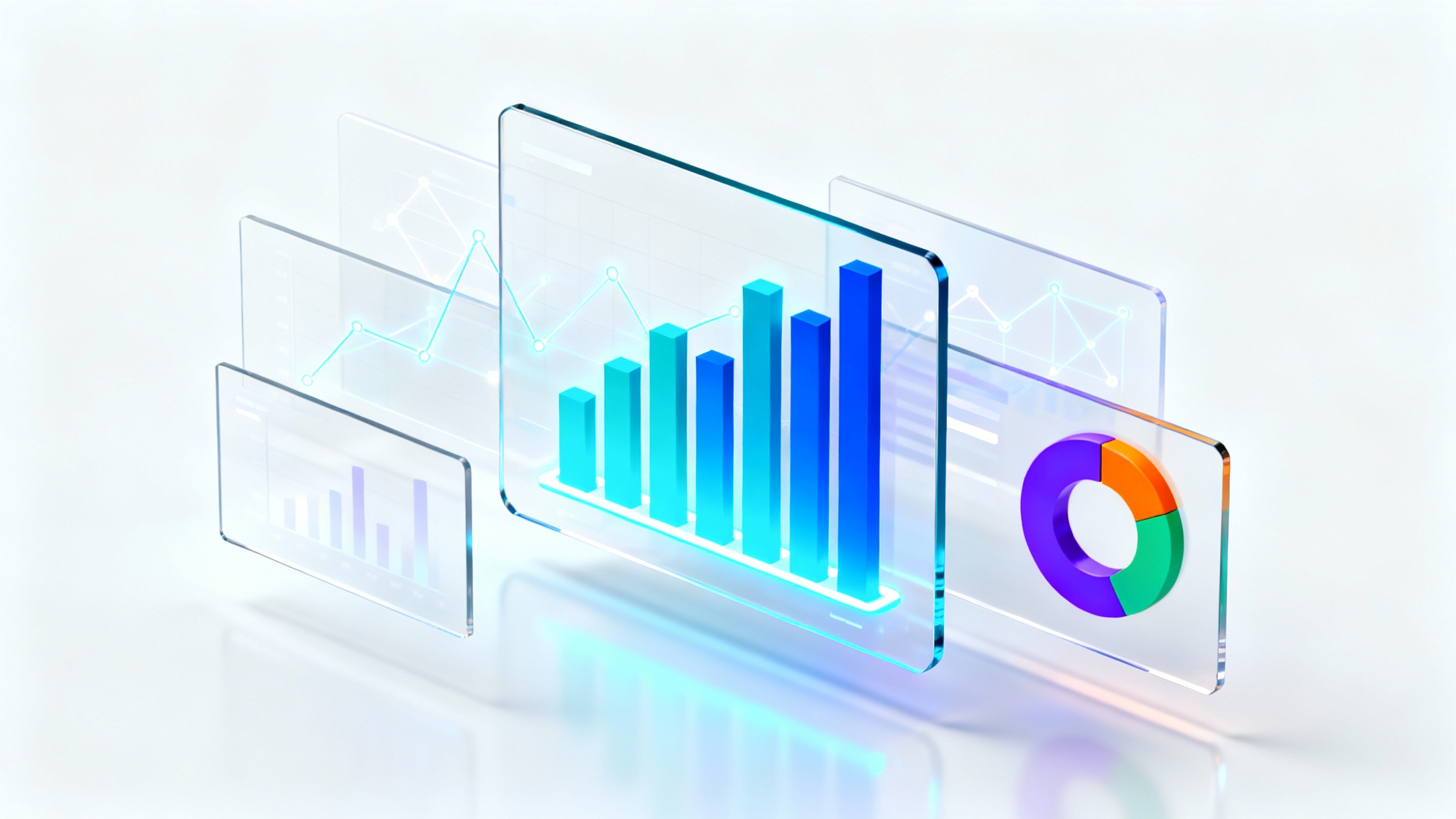
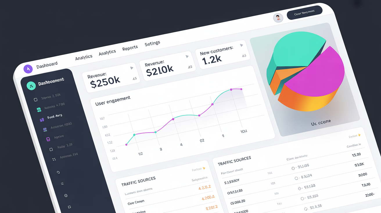
An AI admin dashboard generator is a tool that uses artificial intelligence to create visual mockups of admin panels based on text descriptions. You can specify elements like charts, user lists, KPIs, and color schemes, and the AI will generate a complete design for you.
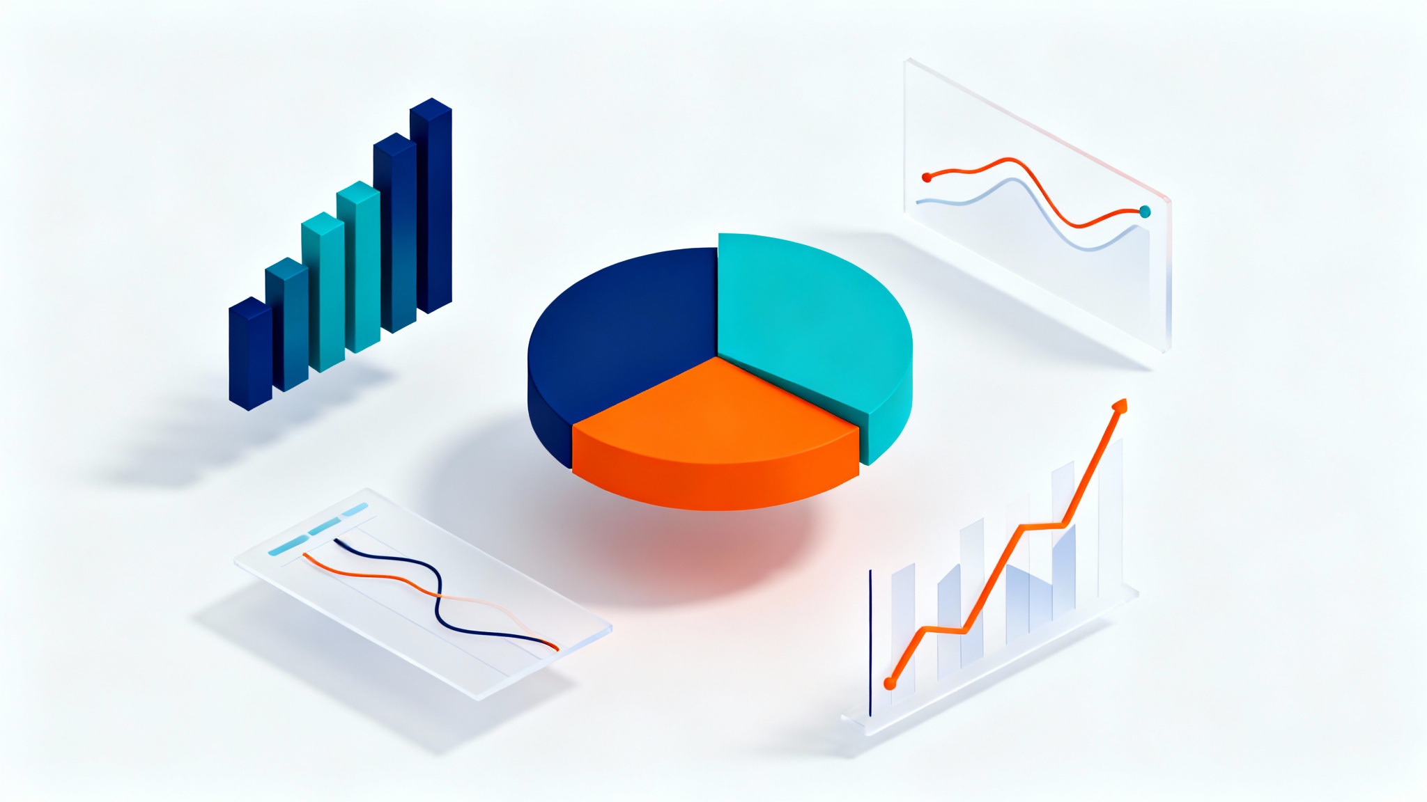
A good admin dashboard provides a clear, at-a-glance overview of key information. It should have an intuitive layout, effective data visualizations like charts and graphs, and be easy to navigate so users can perform their tasks efficiently.
Yes, you can be as descriptive as you want in your prompt. For example, you can ask for 'a line chart showing monthly user growth,' 'a pie chart for traffic sources,' and 'KPI cards for revenue and new sign-ups' to get a tailored design.
It's for everyone involved in product development. Designers can use it for rapid ideation, developers can get a clear visual reference to start building, and product managers can use it to quickly mock up ideas for their teams.
For the best results, describe the purpose of the dashboard, the key data points or KPIs, the types of charts or tables you envision, and any stylistic preferences like 'dark mode,' 'minimalist,' or 'colorful'.
No, you do not need any coding or design skills. All you need is an idea. Simply type what you want to see in the dashboard, and our AI will handle the visual creation process for you.
素晴らしいアプリ、使いやすい。中小企業がさまざまなマーケティング資料を専門的に作成するための時間と費用を節約できるようになります。ありがとう。
私の仕事には優れた背景除去剤が必要で、私はそれをすべて経験してきました。これは今のところ最高です。使い方はとても簡単で、結果は常に素晴らしいものになります。ピクセルカットさん、ありがとうございます!
驚くほど簡単で、バッグやアクセサリーに完璧な結果が得られます。プロのカメラマンが撮影したようです。