私のお気に入りのアプリ
素晴らしいアプリ、使いやすい。中小企業がさまざまなマーケティング資料を専門的に作成するための時間と費用を節約できるようになります。ありがとう。
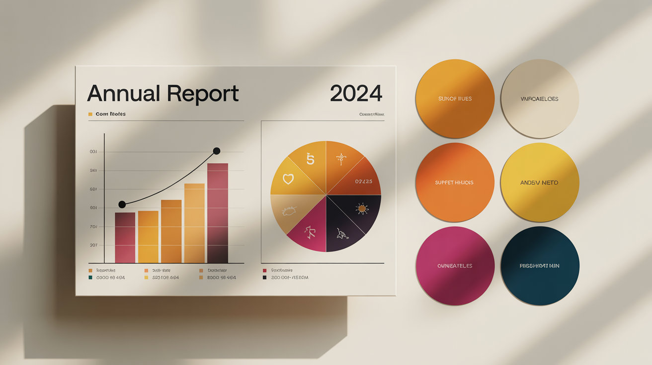
Start by typing a few words about your infographic's topic, mood, or style. For example, 'a serious color palette for a financial report' or 'a playful and bright palette for social media'.
Click the generate button and our AI will create a unique color palette based on your description. It will provide a set of harmonious colors ready for you to use.
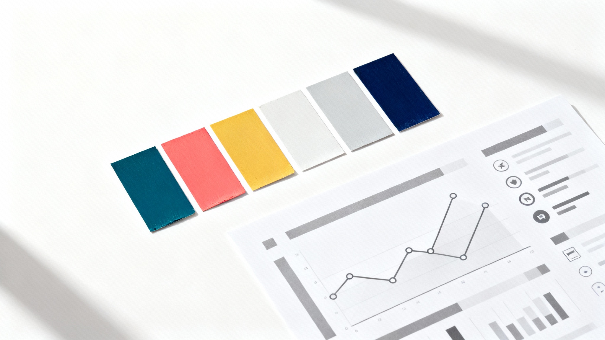
Your custom color palette is generated as a high-resolution PNG image, ready to download. Use this image as a reference in your favorite design tool to create your infographic.
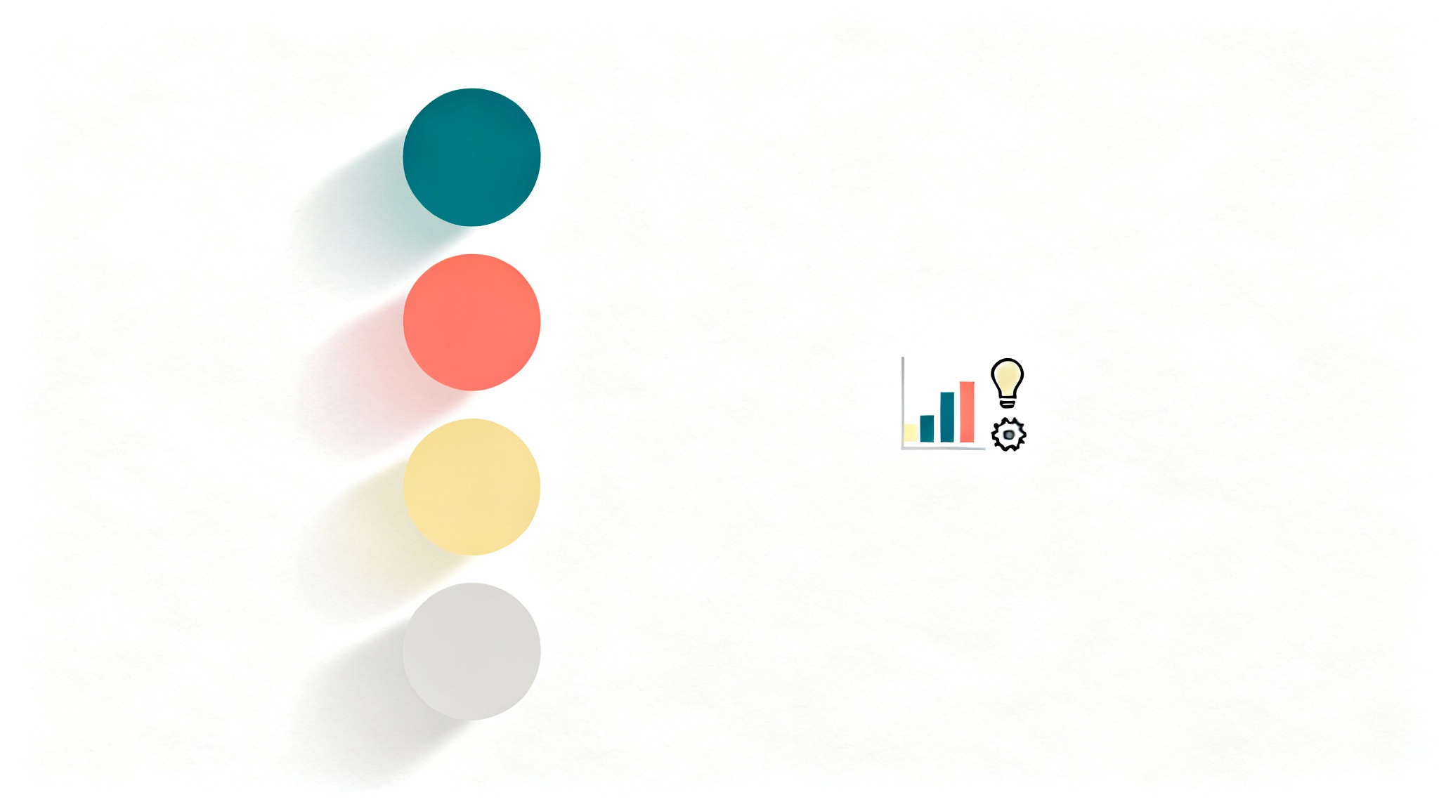
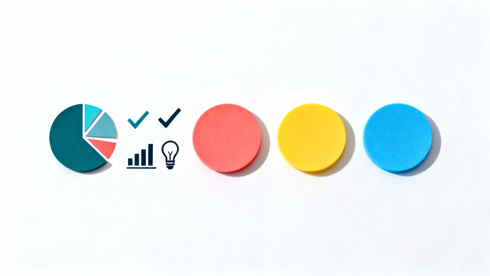
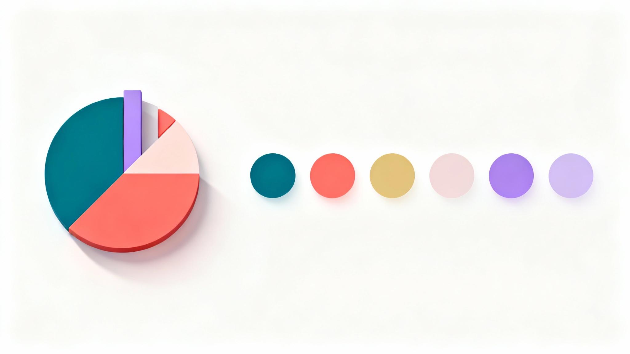
It's generally best to stick to a palette of 3-5 colors. This includes a dominant color, a secondary color, and one or two accent colors to highlight key information without making the design feel cluttered or chaotic.
Our AI analyzes your text prompt, which might include the infographic's topic, mood, or desired colors. It then uses its understanding of color psychology, theory, and context to generate a harmonious palette that matches your description.
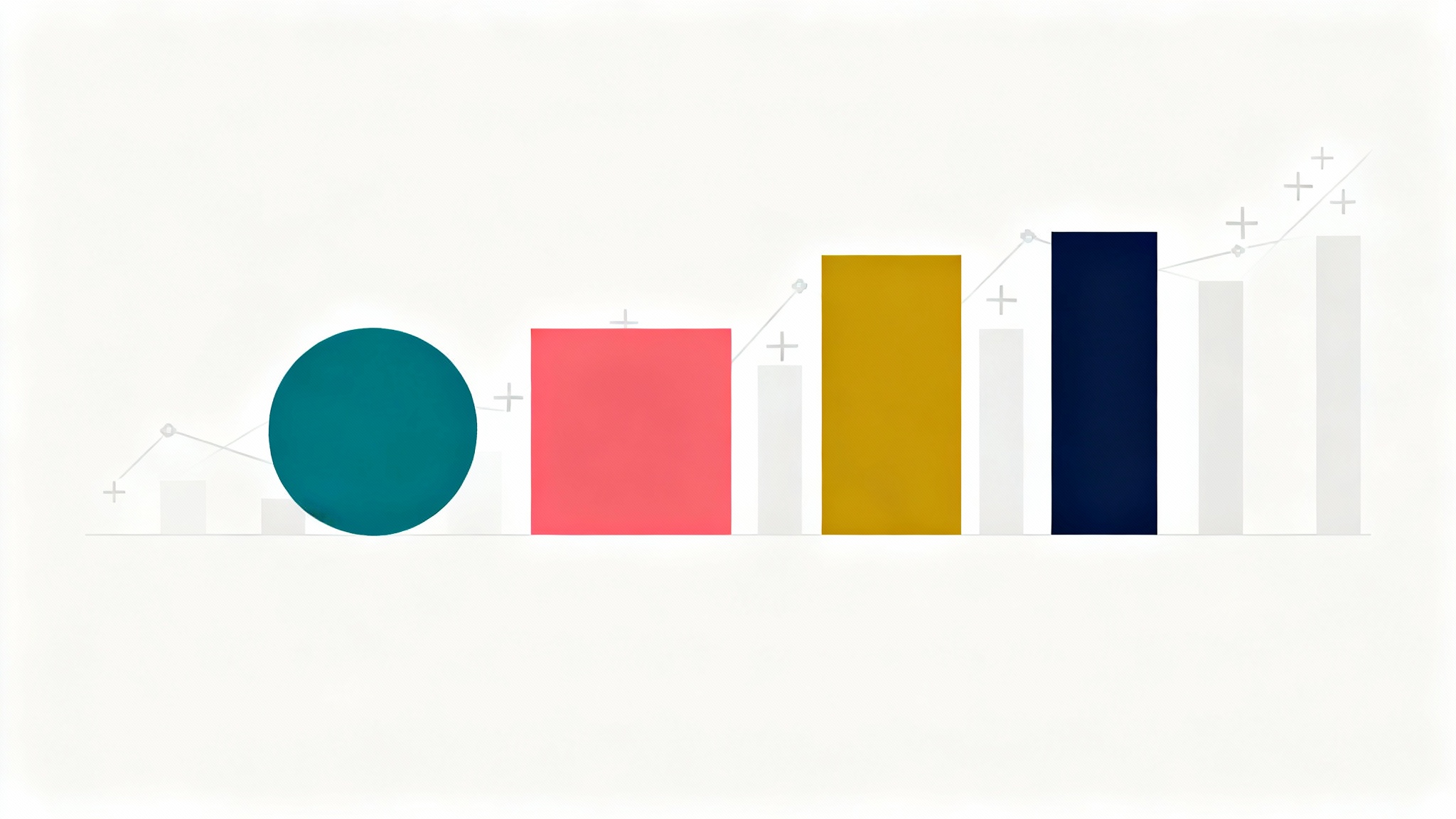
The best colors depend on your data. For distinct categories, use a categorical palette with high-contrast colors. For data that shows a progression, like low to high values, a sequential palette (shades of one color) is effective. For data with a central point, like a positive or negative range, a diverging palette is ideal.
Yes. While you can't upload a brand guide directly, you can describe your brand colors in the prompt. For example, you could write, 'A color palette for a tech startup using a deep navy blue, a bright coral accent, and a light gray'.
Color psychology is the idea that different colors can evoke specific emotions and associations. For example, blue often conveys trust and stability, while red can suggest urgency or importance. Choosing colors with these associations in mind can help reinforce your infographic's message.
To ensure readability, focus on high contrast between your text and background colors. For instance, use light text on a dark background or dark text on a light background. Avoid placing similar-intensity colors next to each other for important text.
素晴らしいアプリ、使いやすい。中小企業がさまざまなマーケティング資料を専門的に作成するための時間と費用を節約できるようになります。ありがとう。
私の仕事には優れた背景除去剤が必要で、私はそれをすべて経験してきました。これは今のところ最高です。使い方はとても簡単で、結果は常に素晴らしいものになります。ピクセルカットさん、ありがとうございます!
驚くほど簡単で、バッグやアクセサリーに完璧な結果が得られます。プロのカメラマンが撮影したようです。