Pixelcut
Three professionally designed data visualization slides arranged on a light gray background, showing examples of bar charts, donut charts, and line graphs with titles like 'Q3 Business Review' and 'User Growth Metrics'.

AI Data Visualization Slide Generator

7000万人に信頼されています
171,800件のレビュー
開発者API
iPhoneAndroid で利用可能

How to Create Data Visualization Slides

  1. 1

    Describe Your Data Slide

    In the text box, write a clear description of the slide you need. Include the chart type, data points, colors, and style. For example, "A slide with a line graph showing a steady increase in user engagement over six months."

  2. 2

    Generate Your Slide

    Click the generate button and let the AI get to work. It will process your description and create a unique, high-quality image of your data visualization slide in just a few moments.

  3. 3

    Download and Present

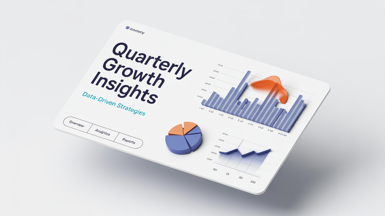
    Your new data visualization slide is ready to download as a watermark-free PNG. Simply save the image and add it to your business report, pitch deck, or academic presentation to make your data shine.
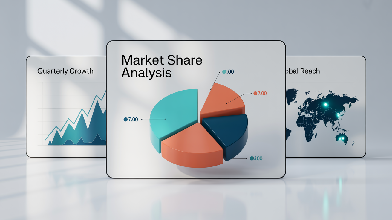
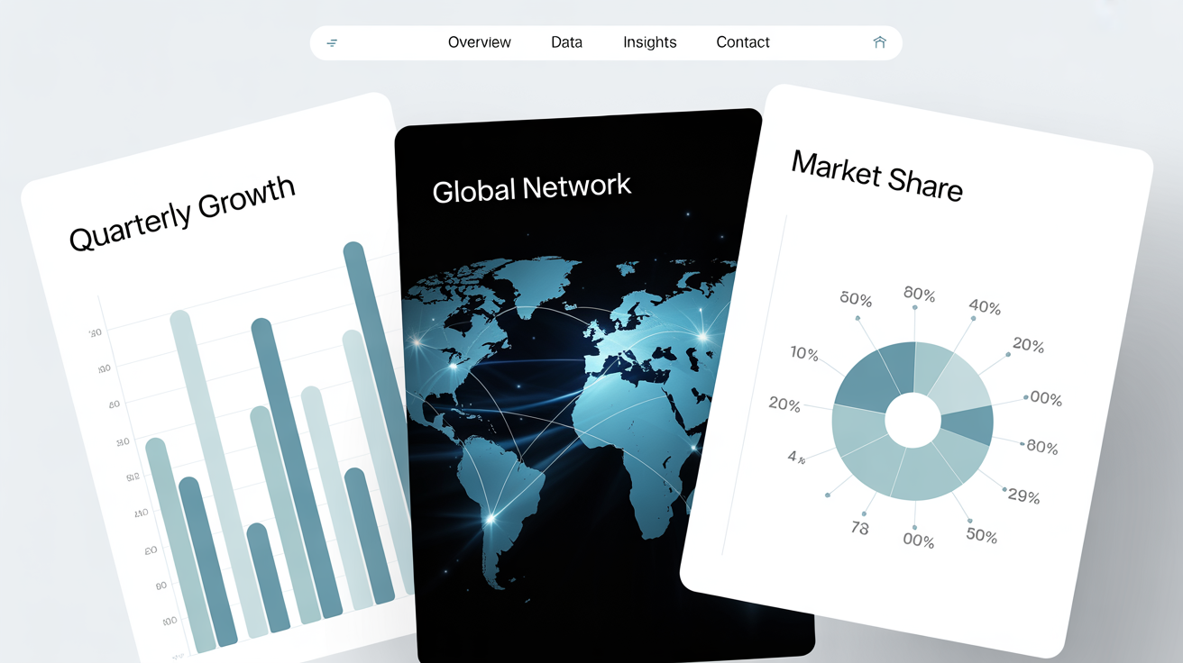
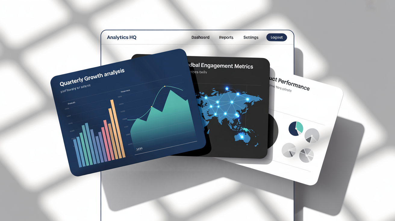
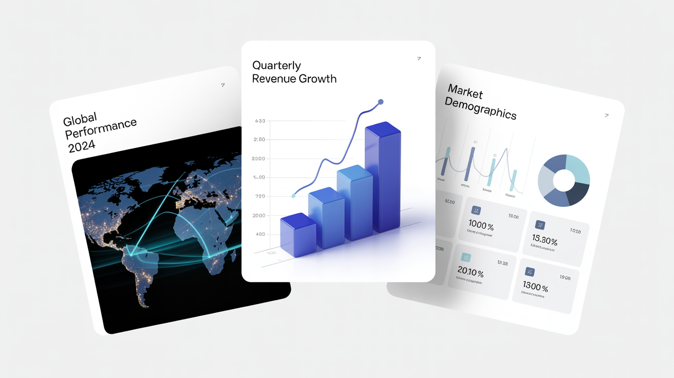
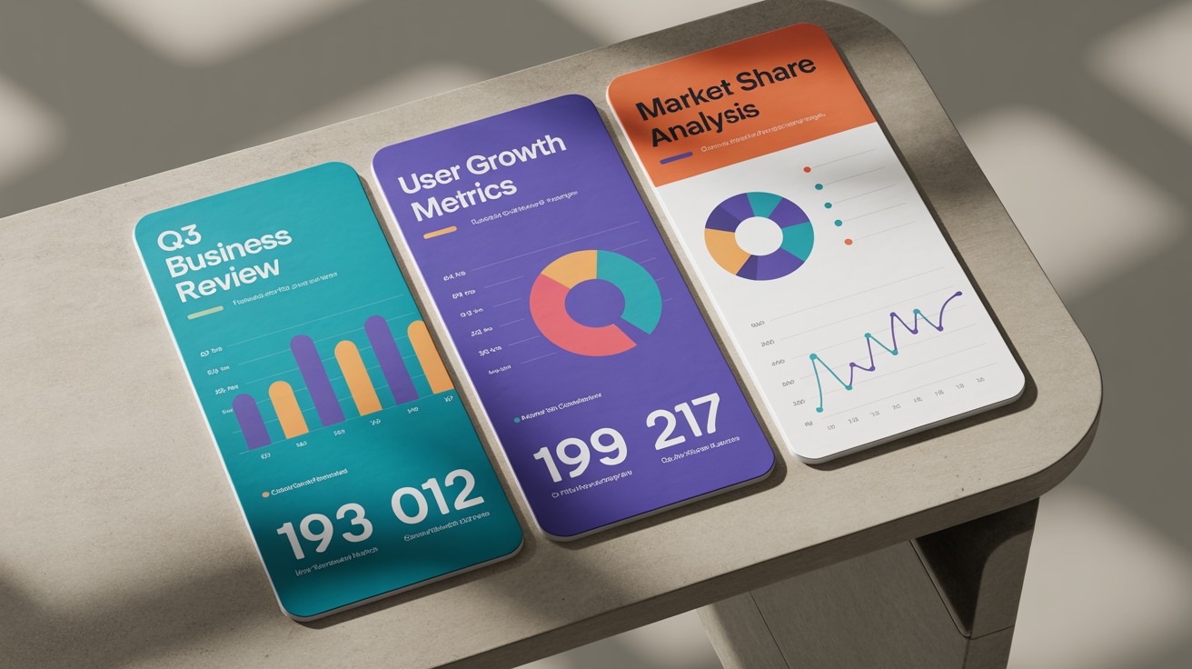
Stop spending hours trying to design the perfect chart. With Pixelcut's AI slide generator, you can turn your ideas and data points into polished, presentation-ready slides in mere moments. Simply describe the pie chart, bar graph, or infographic you envision. Our AI interprets your text to create compelling visuals that effectively communicate your message. This frees you up to focus on the narrative of your presentation, ensuring your data-driven story resonates with your audience, whether they're stakeholders, colleagues, or clients.

Transform Ideas into Impactful Slides Instantly

A mockup of a professional presentation slide for data visualization, featuring bar charts, pie charts, and line graphs in a clean, modern design against a white background.
You don't need a background in graphic design to produce beautiful and effective data visualizations. Our tool automates the design process, generating slides with clean layouts and professional aesthetics. You can guide the AI by specifying color schemes to match your brand, styles from modern to minimalist, and the types of charts that best represent your information. The result is a consistent and visually appealing slide deck that makes your data look as good as the insights it provides, all without manual adjustments.

Professional Design Without the Effort

A professional mockup of three data visualization slides on a white background, showing a pie chart, a line graph, and a world map with data points.
The goal of data visualization is to make complex information easy to understand. Our AI helps you achieve just that by creating charts and graphs that are clear, concise, and impactful. Generate visuals that highlight key trends, compare performance metrics, or break down intricate datasets for your audience. A well-designed slide can turn a confusing collection of numbers into a powerful argument, helping you persuade, inform, and impress in any professional setting. Let your data do the talking through stunning visuals.

Tell a Clearer Story with Your Data

A professional mockup of three data visualization slides on a white background. The slides, featuring a bar chart, a global network map, and a donut chart, are arranged in an elegant, overlapping fan display.
It’s Fast: Go from a simple text prompt to a complete visual slide in seconds, not hours. It’s Customizable: Specify chart types, color palettes, and overall style to align with your presentation's theme. AI-Powered: Leverage artificial intelligence to automatically design clear and professional charts and graphs. Easy to Use: No complex software or design skills needed. If you can describe it, you can create it. Presentation-Ready: Download high-resolution PNG images that are perfect for dropping into any slide deck.

Why use Pixelcut's AI Data Visualization Slide Generator?

A mockup of three professionally designed data visualization slides on a white background, featuring bar charts, a world map, and donut charts with titles like 'Quarterly Growth Analysis'.
Business Meetings: Create slides for quarterly reviews, sales performance reports, and financial updates that clearly present KPIs. Marketing Reports: Visualize campaign results, social media analytics, and customer demographics with engaging infographics. Academic Presentations: Support your research findings with clear charts and graphs for lectures, conferences, and publications. Startup Pitches: Impress investors with professional slides that showcase market analysis, growth projections, and competitive landscapes.

Data Visualization Slide Use Cases

A mockup of three modern data visualization slides on a white background, showing a world map with data points, a bar chart, and a donut chart with KPI widgets.

よくある質問

Pixelcutは200万人以上に愛されています

  • 私のお気に入りのアプリ

    素晴らしいアプリ、使いやすい。中小企業がさまざまなマーケティング資料を専門的に作成するための時間と費用を節約できるようになります。ありがとう。
    シェイリン D.
  • 最高の背景除去剤

    私の仕事には優れた背景除去剤が必要で、私はそれをすべて経験してきました。これは今のところ最高です。使い方はとても簡単で、結果は常に素晴らしいものになります。ピクセルカットさん、ありがとうございます!
    キラ・H
  • 大好きです

    驚くほど簡単で、バッグやアクセサリーに完璧な結果が得られます。プロのカメラマンが撮影したようです。
    メアリー J.