私のお気に入りのアプリ
素晴らしいアプリ、使いやすい。中小企業がさまざまなマーケティング資料を専門的に作成するための時間と費用を節約できるようになります。ありがとう。
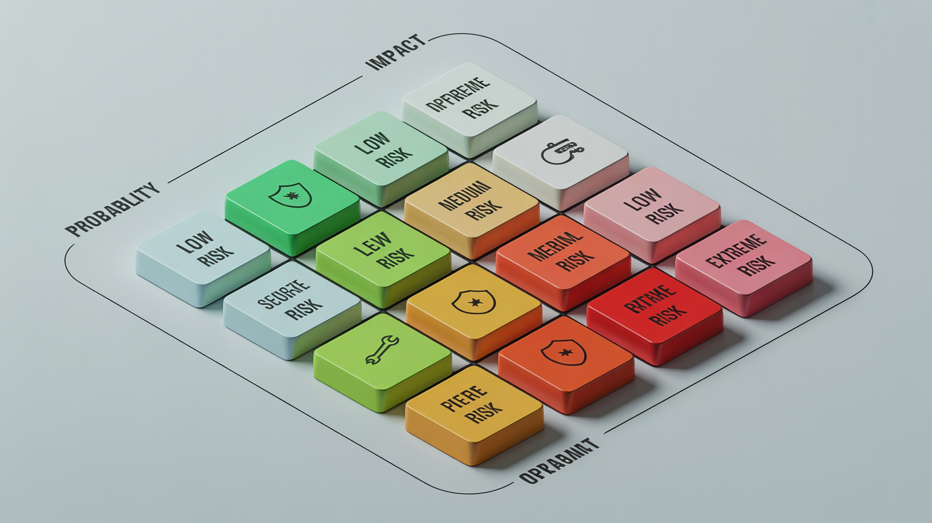
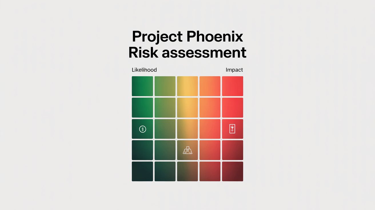
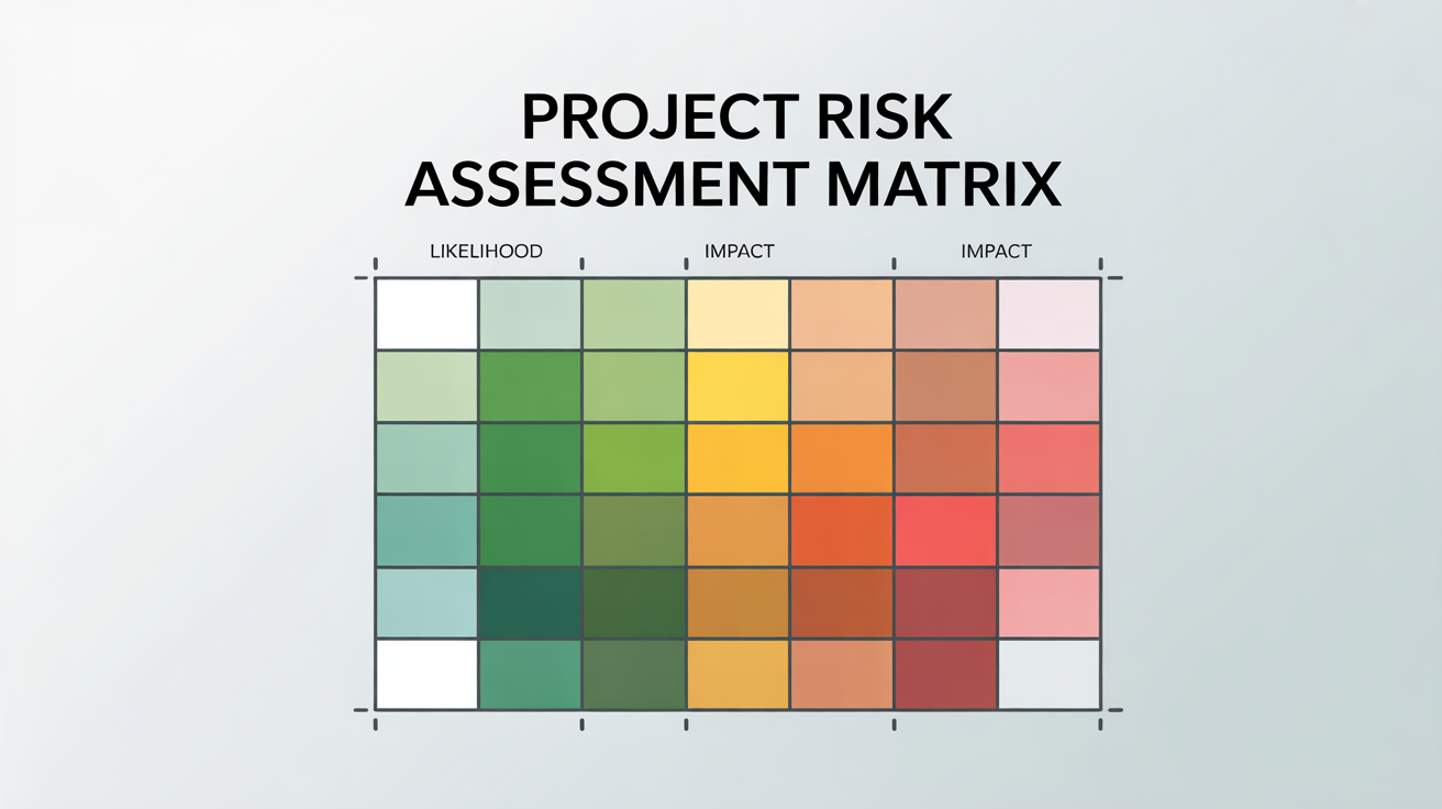
Begin by writing a detailed prompt describing the infographic you need. Include the grid size, axis labels, colors, and any other elements. For example: "A 5x5 risk matrix for project management, with 'Probability' and 'Impact' axes, color-coded from green to red."
Once you're satisfied with your description, click the generate button. Our AI will process your request and create a custom risk matrix infographic for you in moments, turning your text into a professional visual.
Your high-resolution risk matrix is now ready. Download the PNG file to easily integrate it into your project plans, stakeholder presentations, or team reports. All downloads are watermark-free and ready for immediate use.
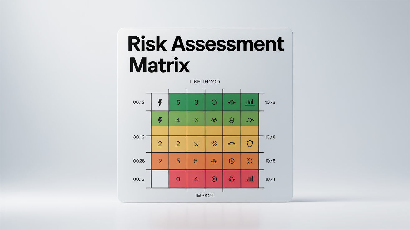
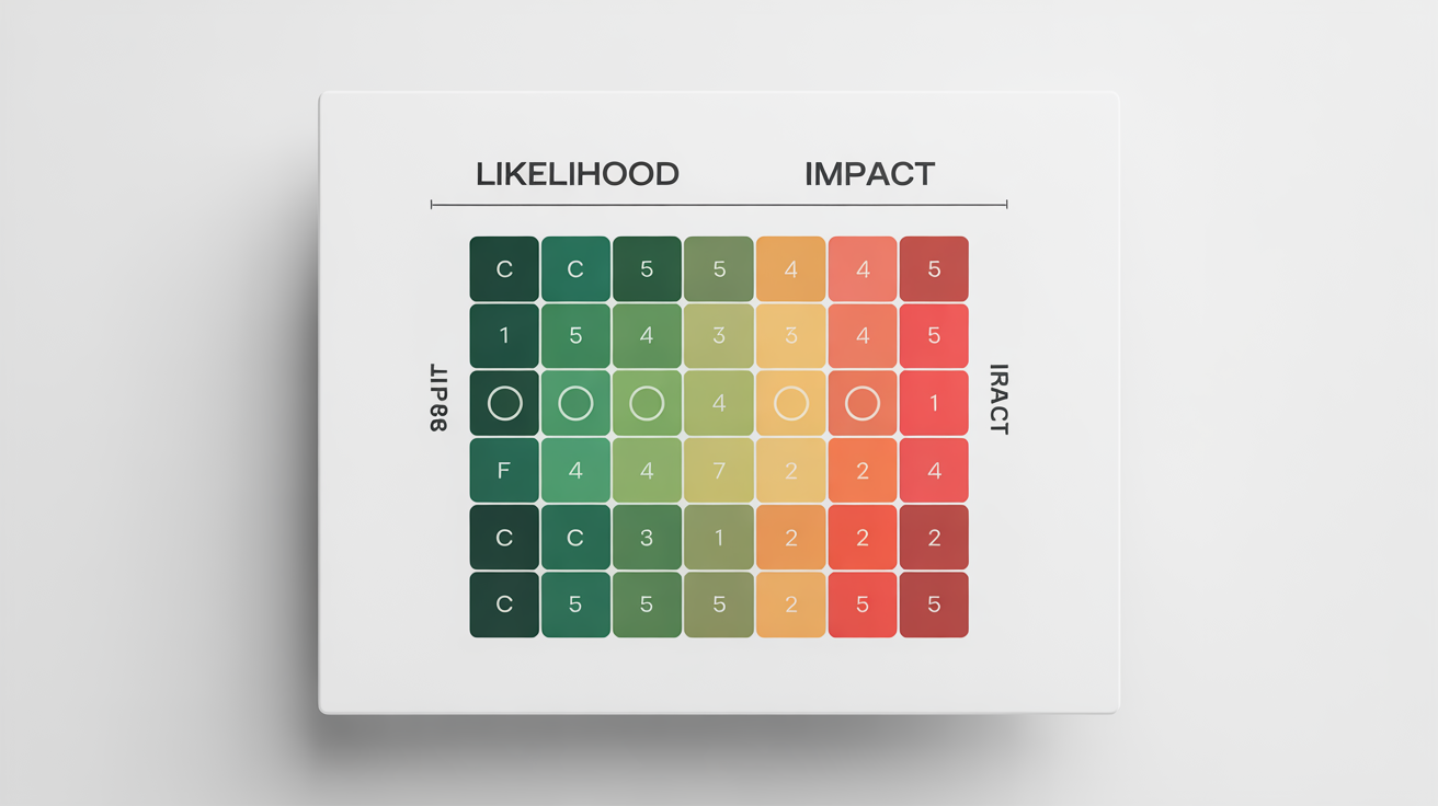
An AI risk matrix infographic generator is a tool that uses artificial intelligence to create a visual representation of a risk assessment matrix from a simple text description. You can specify the grid size, axis labels, colors, and other details, and the AI will generate a complete infographic for you automatically.
To create a 5x5 risk matrix, you just need to include that detail in your prompt. For example, you could type, "Create a 5x5 risk matrix with 'Likelihood' on the y-axis and 'Impact' on the x-axis." The AI will then generate an infographic with the specified five-by-five grid structure.
Yes, you can guide the AI to use your brand's visual identity. In your prompt, describe the color palette you want to use, for example, "Use a color scheme of dark blue, light grey, and orange." You can also upload an image of your logo and describe where it should be placed in the final design.
For the best results, provide a clear description of your desired infographic. Include the number of rows and columns for the grid (e.g., 5x5), the labels for the horizontal and vertical axes (e.g., 'Probability' and 'Severity'), the desired color-coding (e.g., 'from green for low risk to red for high risk'), and any specific text or icons you want to see.
To make changes to your risk matrix infographic, you can refine your text prompt with new instructions and generate the image again. Try adding more specific details or changing your descriptions of the colors, labels, or layout to get closer to your desired result.
You can download your final risk matrix infographic as a high-resolution PNG file. This format is ideal for inserting into presentations, embedding in reports, or sharing digitally with your team and stakeholders.
素晴らしいアプリ、使いやすい。中小企業がさまざまなマーケティング資料を専門的に作成するための時間と費用を節約できるようになります。ありがとう。
私の仕事には優れた背景除去剤が必要で、私はそれをすべて経験してきました。これは今のところ最高です。使い方はとても簡単で、結果は常に素晴らしいものになります。ピクセルカットさん、ありがとうございます!
驚くほど簡単で、バッグやアクセサリーに完璧な結果が得られます。プロのカメラマンが撮影したようです。