My favorite app
Great app, easy to use. Helps our small business save time and money to create different marketing materials professionally. Thank you.
In the text box, write a clear description of the slide you need. Include the chart type, data points, colors, and style. For example, "A slide with a line graph showing a steady increase in user engagement over six months."
Click the generate button and let the AI get to work. It will process your description and create a unique, high-quality image of your data visualization slide in just a few moments.
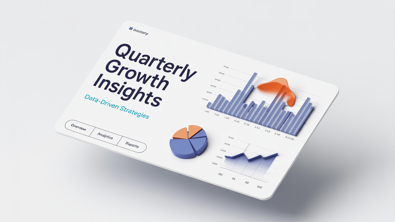
Your new data visualization slide is ready to download as a watermark-free PNG. Simply save the image and add it to your business report, pitch deck, or academic presentation to make your data shine.
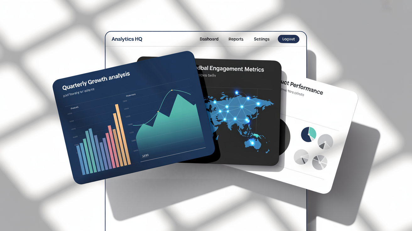
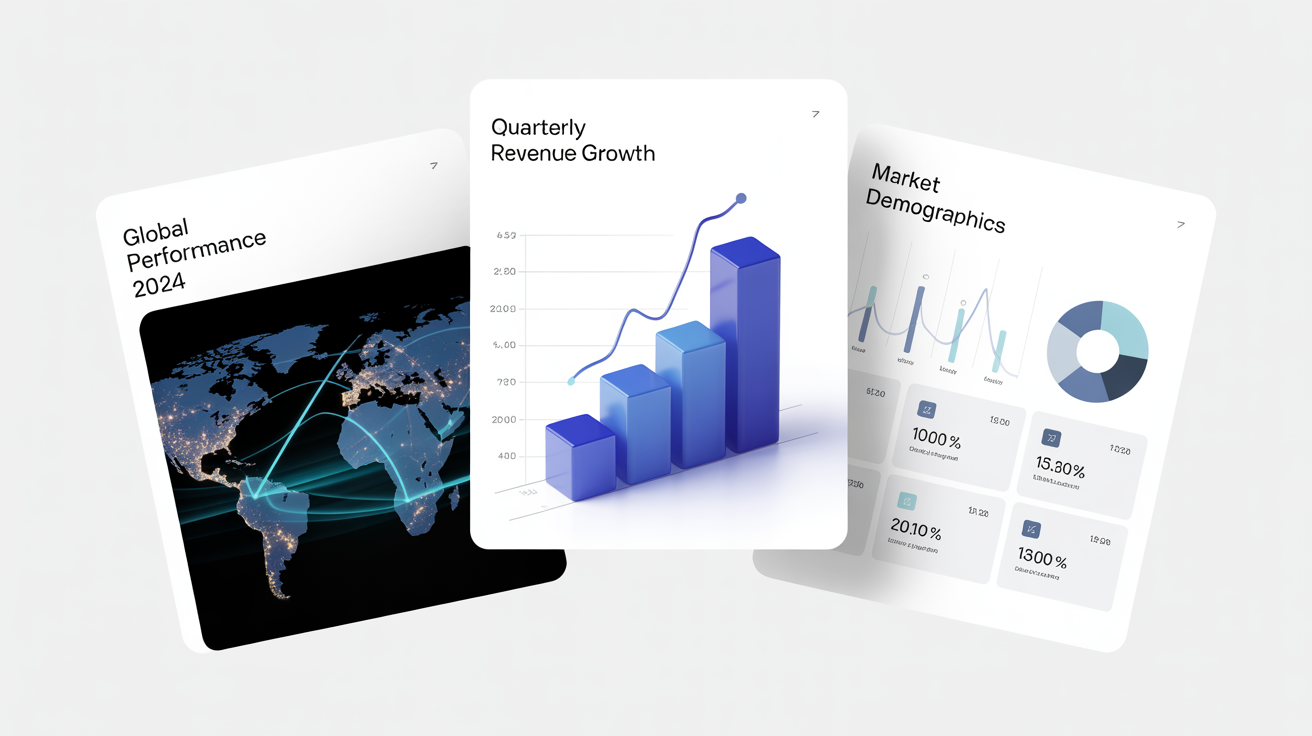
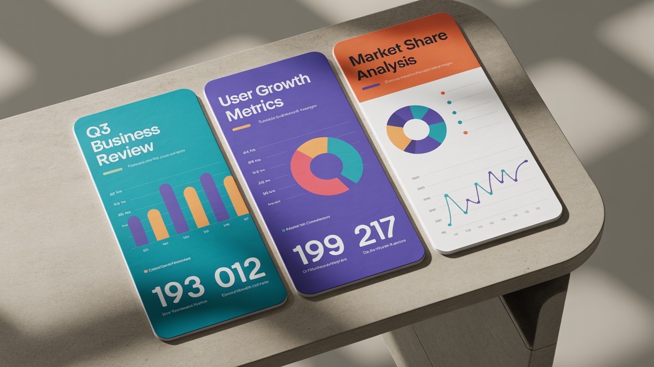
An AI data visualization slide generator is a tool that uses artificial intelligence to create images of presentation slides containing charts and graphs based on your text descriptions. You can specify the type of chart, the data it should represent, colors, and style, and the AI will generate a visual for you.
Yes, you can be as specific as you like in your prompt. Describe whether you want a bar chart, pie chart, line graph, or another type of visual. The more detail you provide about the design, the closer the result will be to your vision.
You don't need to input raw data spreadsheets. Instead, you describe the visualization you want to see. For example, you can say "a pie chart showing 60% for 'Product A', 30% for 'Product B', and 10% for 'Product C'" to have the AI create a representative visual.
After the AI creates your data visualization slide, you can download it as a high-resolution, watermark-free PNG image. This image can then be easily inserted into your presentations in tools like PowerPoint, Google Slides, or Keynote.
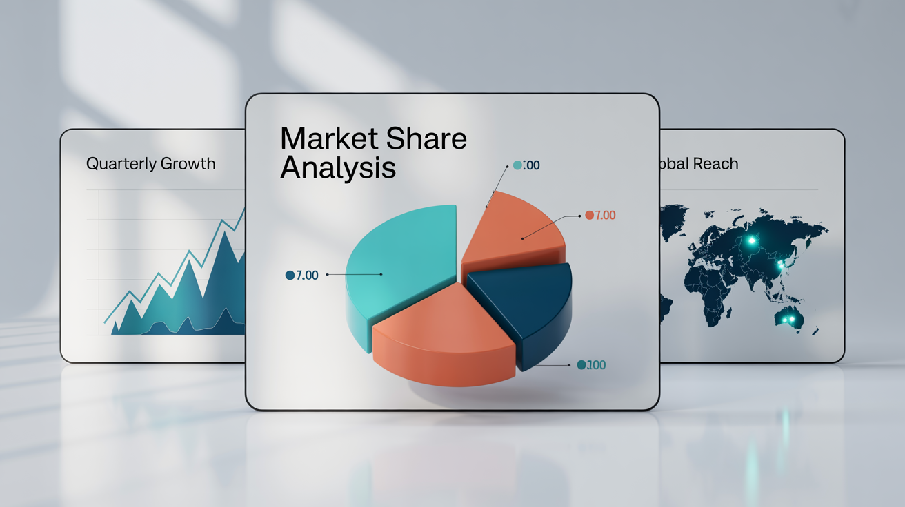
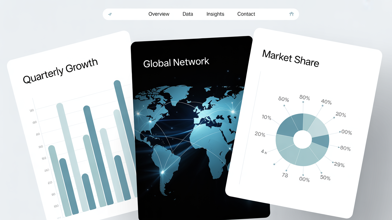
This tool is designed to generate individual slide images based on your prompts. You can create multiple slides one by one to build out the visual components of your presentation, then add them to the slide deck of your choice.
Not at all. The tool is made for everyone, regardless of design experience. The AI handles the layout, color balance, and formatting to ensure the generated slide looks clean and professional, allowing you to focus on the information you want to convey.
Great app, easy to use. Helps our small business save time and money to create different marketing materials professionally. Thank you.
I need a good background remover for my work and I've been through them all it feels like. This one is the best by far. It's so easy to use and the results always look amazing. Thank you Pixelcut!
It's amazingly easy and gives the perfect results for my bags and accessories. It looks like it was done by a professional photographer.