My favorite app
Great app, easy to use. Helps our small business save time and money to create different marketing materials professionally. Thank you.
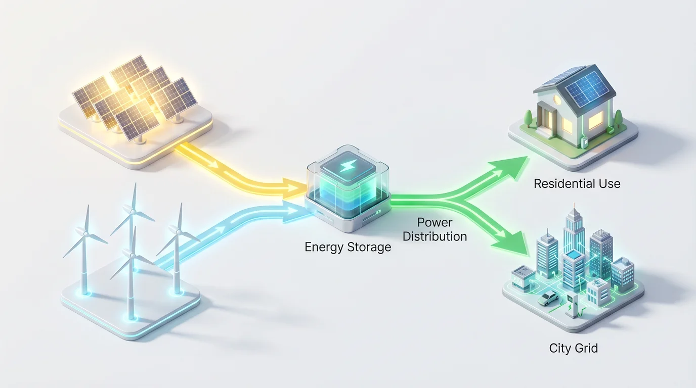
Write a prompt detailing the sources, transfers, and uses of energy. For example, 'Energy from a power plant flows to a substation, which then distributes it to homes and factories.'
Our AI will process your description and create a visual representation of the energy flow, complete with labels and directional arrows that illustrate how energy is transformed.
Your high-resolution energy flow diagram is ready to be downloaded. Use it in your reports, presentations, or academic work, completely watermark-free.
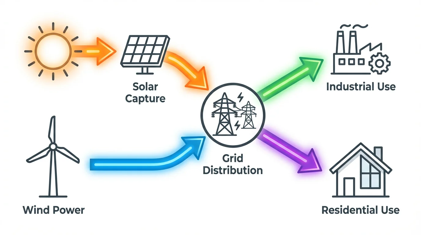
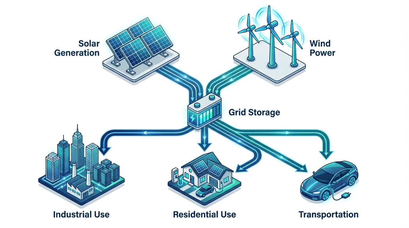
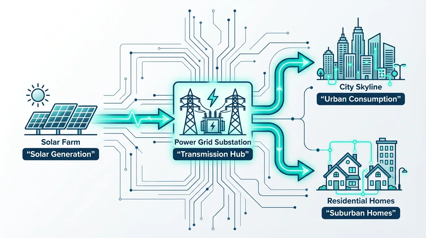
An AI energy flow diagram generator is a tool that uses artificial intelligence to automatically create a visual representation of how energy moves through a system. You simply provide a text description, and the AI builds the diagram for you, saving time and effort compared to manual tools.
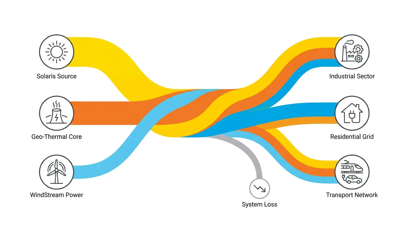
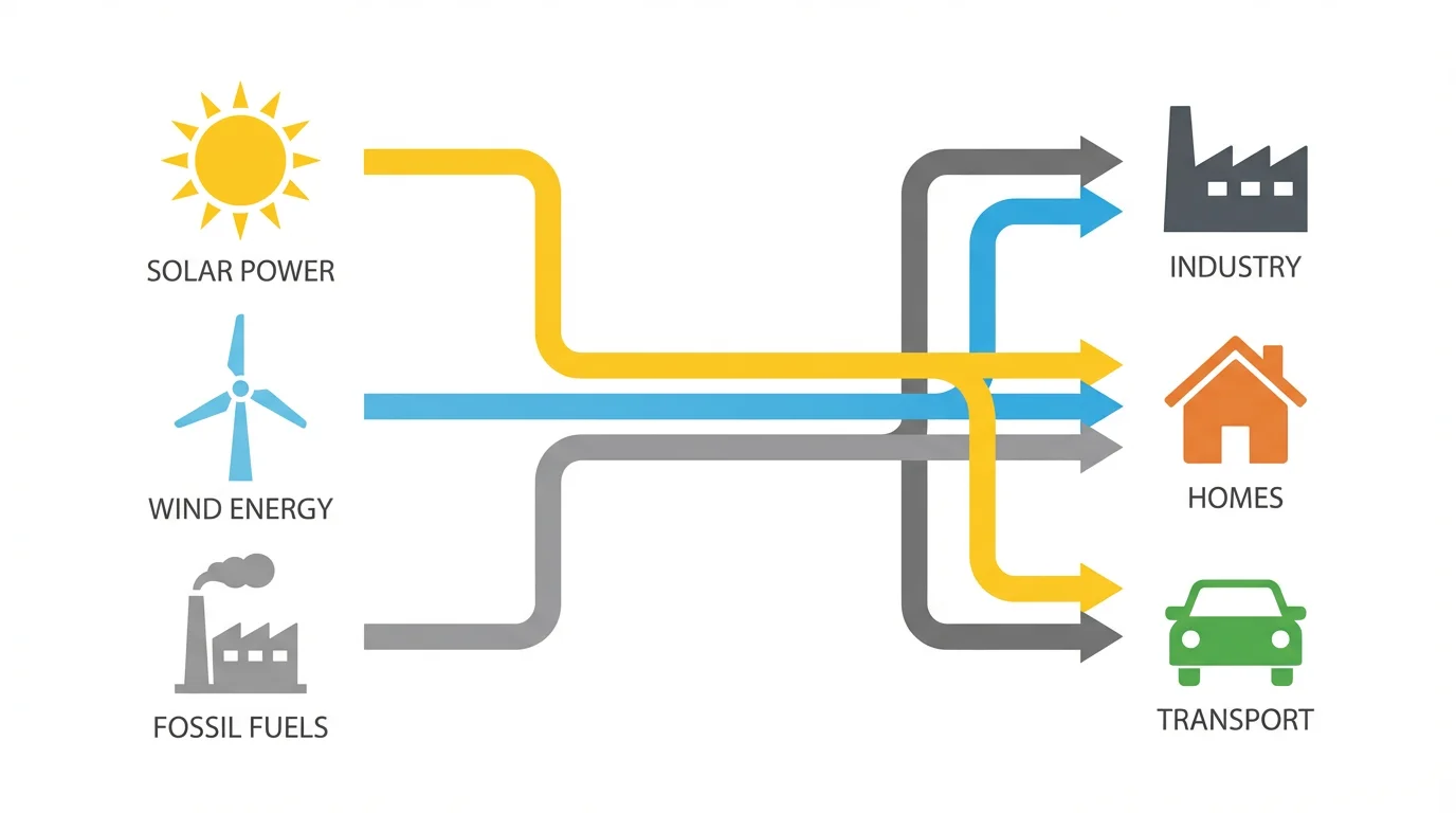
To create a Sankey diagram, describe the flow of energy in your prompt, including the sources, the different stages, and the final outputs or losses. The AI will interpret this as a Sankey diagram, where the width of the arrows represents the quantity of energy at that stage.
You need to describe the components of your system. This includes the primary energy sources (e.g., solar, coal), the conversion processes (e.g., power plant), the distribution paths, and the end-users or points of consumption (e.g., residential, industrial). Mentioning quantities or proportions will help the AI create a more accurate diagram.
Yes, you can include details about colors and flow sizes in your text prompt. For example, you could write "Show solar energy in yellow and wind energy in blue, with a thicker arrow for the main transmission line." The AI will use these details to customize your diagram.
Yes, you can try the energy flow diagram generator for free. After using your free credits, you can purchase more to continue creating diagrams. All downloaded images are high-resolution and do not contain a watermark.
Absolutely. While the tool is designed for energy flow diagrams, its core function is to visualize flow. You can use it to create Sankey diagrams for financial data, supply chain management, user website journeys, or any other system where you need to show the movement of resources through various stages.
Great app, easy to use. Helps our small business save time and money to create different marketing materials professionally. Thank you.
I need a good background remover for my work and I've been through them all it feels like. This one is the best by far. It's so easy to use and the results always look amazing. Thank you Pixelcut!
It's amazingly easy and gives the perfect results for my bags and accessories. It looks like it was done by a professional photographer.