My favorite app
Great app, easy to use. Helps our small business save time and money to create different marketing materials professionally. Thank you.
Start by uploading an image, text file, or data file. This could be anything from a rough sketch of a network to a document you want to analyze.
In the text prompt, explain how you want your data visualized. Specify what the nodes and relationships are, and add details like colors or labels.
With your file uploaded and prompt entered, click to generate. Our AI will analyze your input and create a custom knowledge graph visualization in seconds.
Your high-resolution knowledge graph is ready to download as a watermark-free PNG. Use it in your presentations, reports, or personal projects.


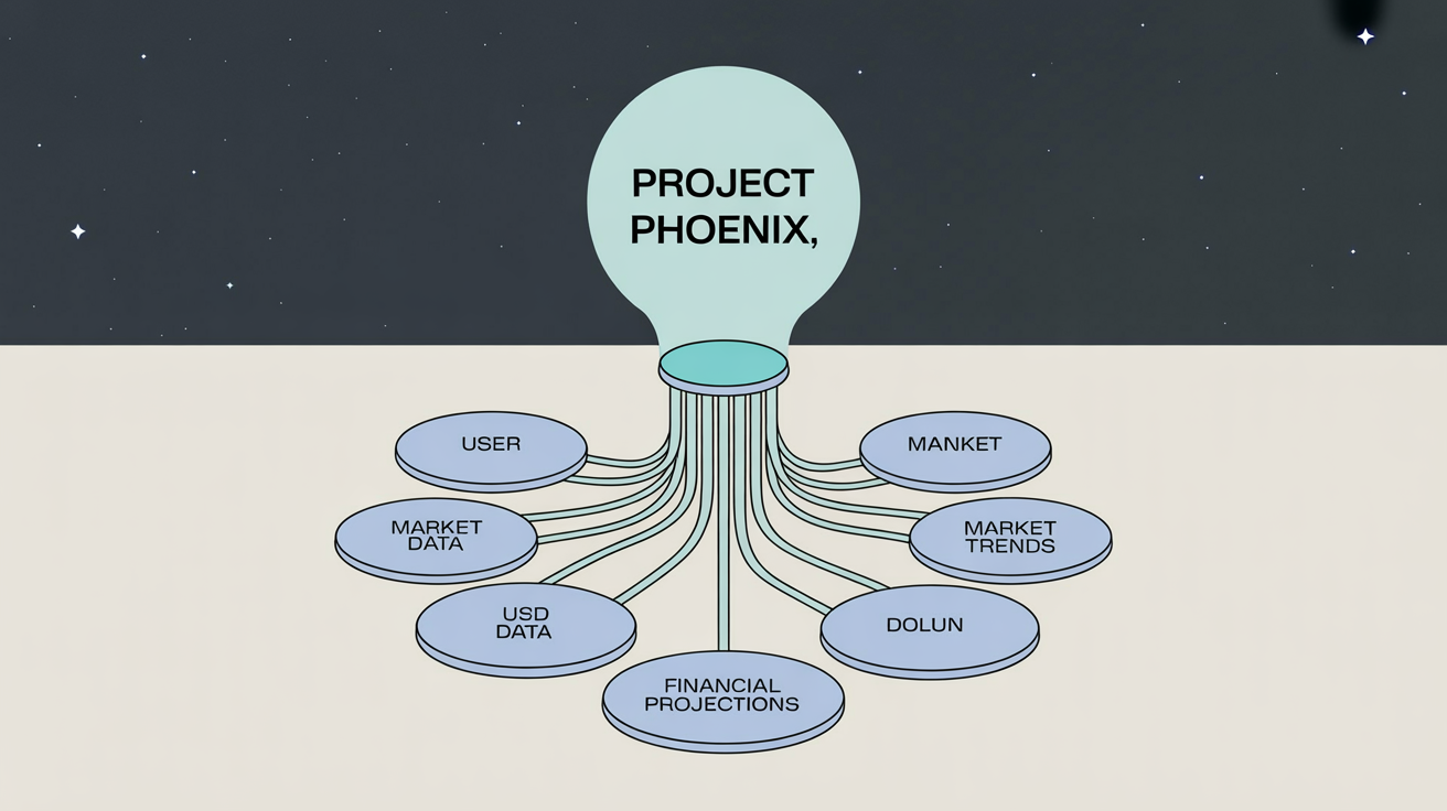
An AI knowledge graph visualizer is a tool that uses artificial intelligence to automatically create a visual map of interconnected data from text or uploaded files. It identifies key entities (nodes) and their relationships (edges) to build a clear, structured diagram, helping you make sense of complex information without manual effort.
To create a knowledge graph, first upload a file containing your data, which could be a text document, a spreadsheet, or even a simple sketch. Then, write a text prompt describing what you want to visualize, including any specific colors or labels for nodes and relationships. The AI will then generate the knowledge graph for you to download.
You can use a wide variety of data. This includes unstructured text from documents, structured data like names and connections from a CSV file, or even a prompt describing a network of concepts from scratch. The tool is designed to identify entities and relationships from both textual descriptions and pre-existing datasets.
Yes, you can customize your knowledge graph using text prompts. Describe how you want the nodes and edges to look. For example, you can ask the AI to 'make all 'People' nodes blue' or 'label the connection between 'Company A' and 'Company B' as 'partnership'.' The AI will apply these stylistic instructions to the final visualization.
Absolutely. The tool is designed to be intuitive for everyone. Non-technical users can easily upload files and use natural language to describe what they want to see. Technical users can also leverage it for rapid prototyping and visualizing complex system architectures without needing to write code for a visualization library.
You can use your generated knowledge graph for many purposes. Add it to business reports and presentations to explain complex systems, use it for academic research to show data relationships, or use it as a personal tool for brainstorming and organizing ideas. The high-resolution PNG download makes it easy to share and use anywhere.
Great app, easy to use. Helps our small business save time and money to create different marketing materials professionally. Thank you.
I need a good background remover for my work and I've been through them all it feels like. This one is the best by far. It's so easy to use and the results always look amazing. Thank you Pixelcut!
It's amazingly easy and gives the perfect results for my bags and accessories. It looks like it was done by a professional photographer.