Pixelcut
A professionally designed Power Spectral Density plot showing the final output from a data analysis tool. The graph displays three colored signal lines against frequency and power axes, set on a clean white background.

AI Power Spectral Density Plot Generator

Trusted by 70 million people
171,800 Reviews
Developer API
Available on iPhone & Android

How to Create a Power Spectral Density Plot

  1. 1

    Upload Your Signal Data

    Begin by uploading your time-series data. This should be a file containing your signal measurements, like a CSV or TXT file.

  2. 2

    Describe Your Desired Plot Style

    In the text box, explain how you want your plot to look. Specify things like 'use a logarithmic frequency scale' or 'make the plot line green'.

  3. 3

    Generate PSD Plot

    Click the generate button. Our AI will process your data, calculate the Power Spectral Density, and apply the custom styles you described.

  4. 4

    Download Your Plot

    Your high-resolution PSD plot is ready to download. Save the watermark-free PNG file for use in your research, reports, or projects.
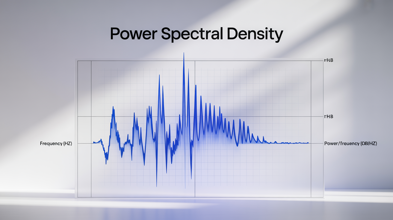
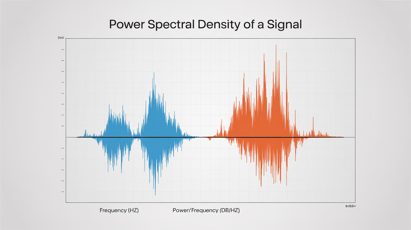
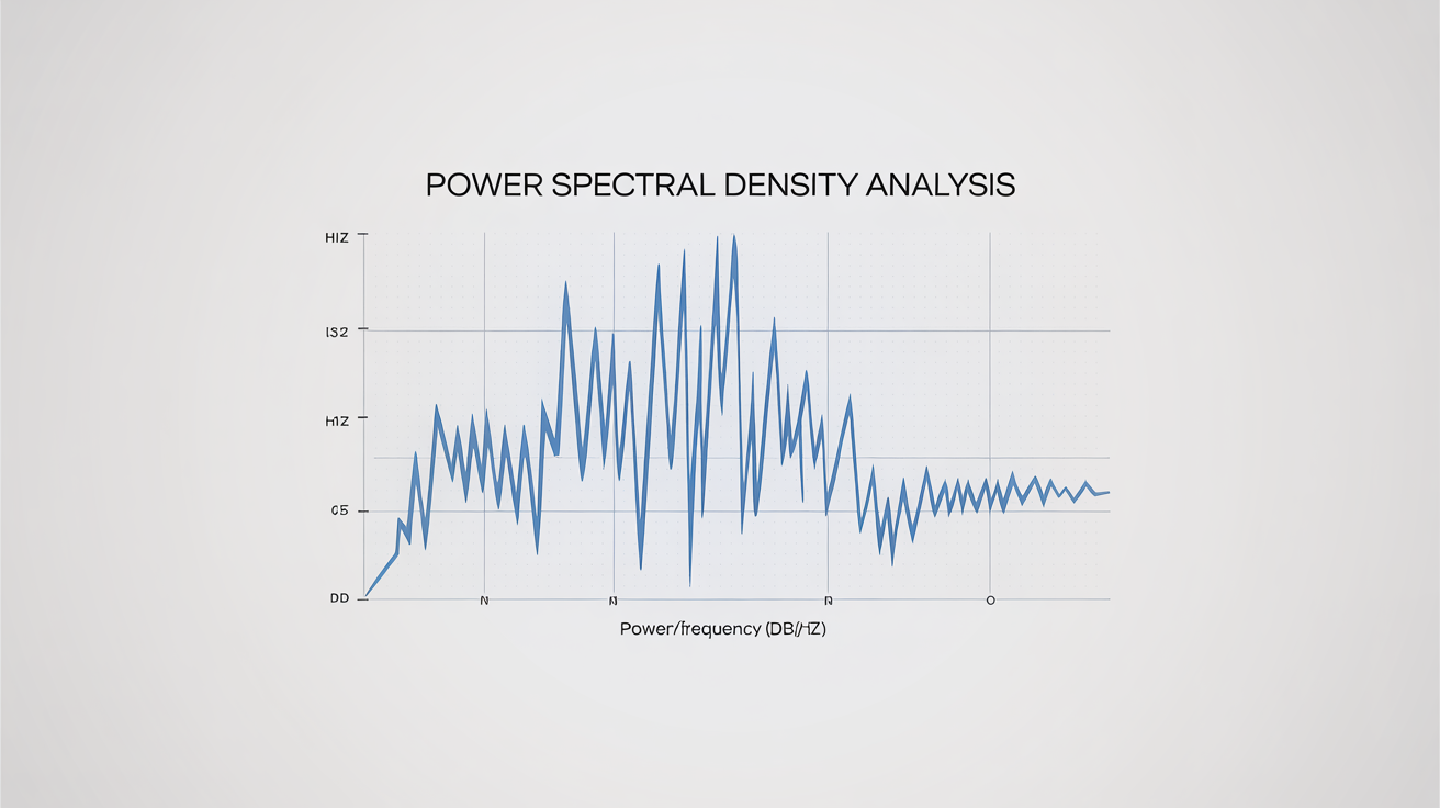
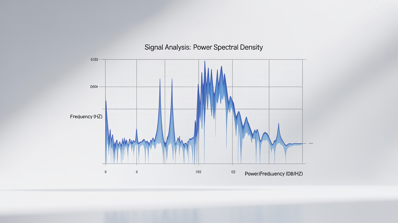
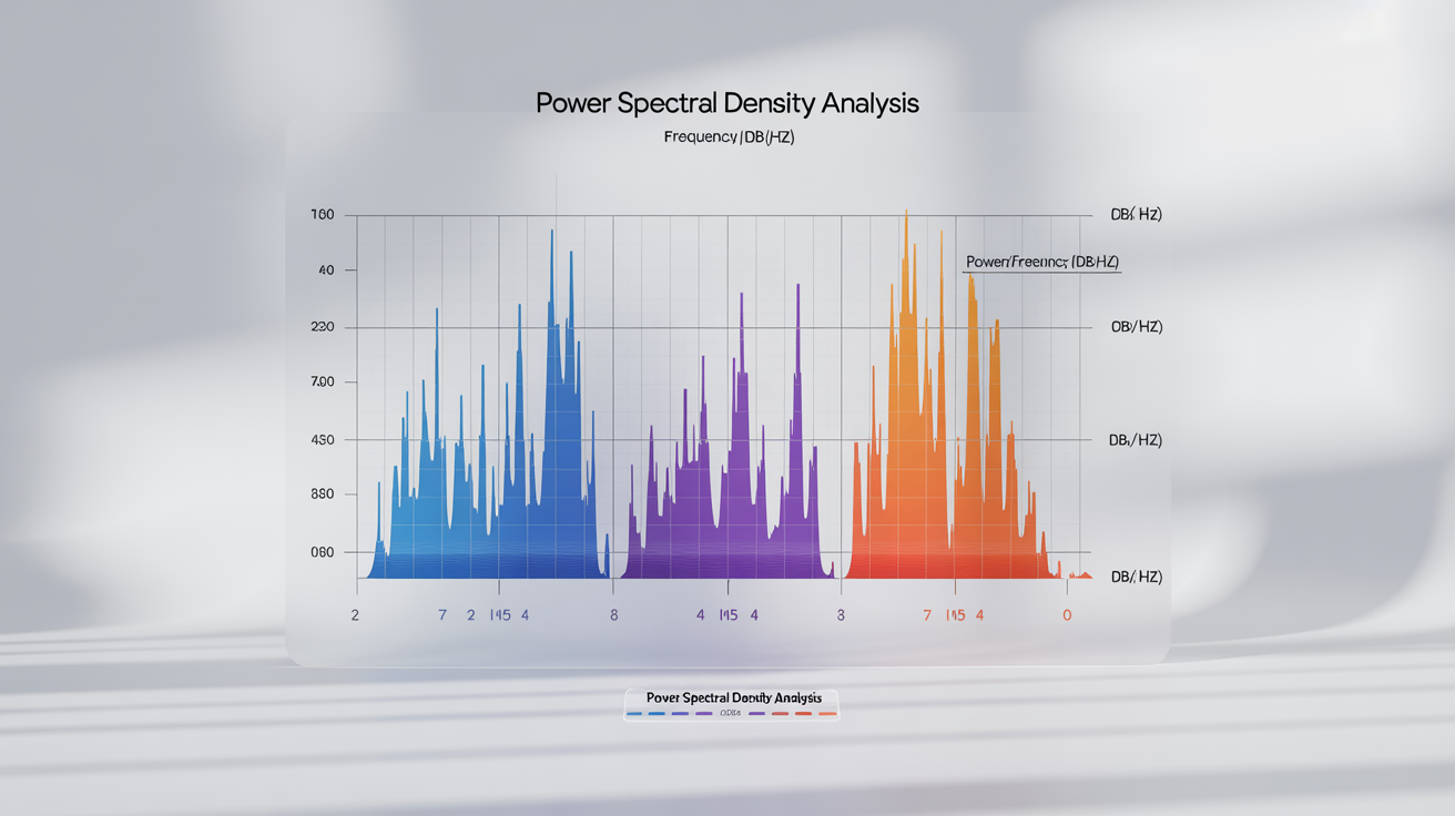
Move from raw time-series data to a clear frequency-domain view without writing a single line of code. A Power Spectral Density (PSD) plot shows how the power of a signal is distributed over different frequencies. Our tool lets you upload your data file, and it instantly calculates and visualizes the PSD for you. This is perfect for identifying dominant frequencies, analyzing random signals, or characterizing broadband noise in your data. Get immediate insights into the spectral characteristics of your signals with just a few clicks.

Instant Frequency Domain Insights

A modern, clear Power Spectral Density plot on a white background. The graph shows a vibrant blue line with several peaks, with axes clearly labeled 'Frequency (Hz)' and 'Power/Frequency (dB/Hz)'.
Take control of your plot's appearance using conversational language. After uploading your signal data, describe how you want the plot to look. You can specify details like axis labels, colors for the plot lines, titles, and whether to use a logarithmic or linear scale for the frequency or power axes. This unique AI-powered feature allows you to tailor the visualization to your specific presentation or analysis needs, creating professional-grade charts that are easy to interpret and share with others in your field.

Customize Your Plot with Simple Text

A modern power spectral density plot showing the power of a signal versus frequency. The graph has a title 'Power Spectral Density of a Signal', an x-axis labeled 'Frequency (Hz)', and a y-axis labeled 'Power/Frequency (dB/Hz)'. Two data lines, one blue and one orange, display several distinct peaks.
Download your Power Spectral Density plots as high-resolution, watermark-free PNG files. These images are ideal for inclusion in academic papers, technical reports, engineering presentations, or online publications. The clean, crisp output ensures that every detail of your frequency analysis is visible and professionally presented. No more struggling with complex plotting libraries or settling for low-quality screenshots. Generate a publication-ready PSD plot that clearly communicates your findings and is ready for immediate use.

High-Resolution Plots for Any Application

A clear and modern graph of a Power Spectral Density plot. The x-axis is labeled 'Frequency (Hz)' and the y-axis is 'Power/Frequency (dB/Hz)'. A blue line shows a signal with several peaks.
It’s Effortless: Skip the Python or MATLAB scripts. Just upload your data and generate. It's AI-Styled: Use natural language to customize your plot's look and feel, from axis types to line colors. It’s Quick: Go from a raw data file to a finished PSD plot in moments, not hours. It’s for Everyone: Whether you're an engineer, a student, or a researcher, our tool makes signal analysis accessible. It’s Ready to Use: Download high-quality plots ready for your reports and presentations.

Why use Pixelcut's AI Power Spectral Density Plot Generator?

A modern, cleanly designed Power Spectral Density plot. The graph shows a blue line with several peaks, representing signal power. The x-axis is labeled 'Frequency (Hz)', the y-axis is 'Power/Frequency (dB/Hz)', and the title is 'Signal Analysis: Power Spectral Density'.
Vibration Analysis: Identify resonant frequencies in mechanical systems to diagnose issues or prevent failures. Audio Processing: Analyze the frequency content of sound signals for tasks like equalization or noise reduction. Biomedical Signals: Study brain activity (EEG) or heart rhythms (ECG) by examining their power distribution across different frequency bands. Telecommunications: Characterize the frequency usage and noise levels in communication channels to optimize performance. Finance: Analyze financial time-series data to identify periodicities or cyclical patterns in market behavior.

Power Spectral Density Plot Use Cases

A scientific Power Spectral Density plot showing signal power versus frequency. The graph features vibrant blue and red lines with distinct peaks, set against a clean white background.

Frequently Asked Questions

Pixelcut is loved by over 2 million people

  • My favorite app

    Great app, easy to use. Helps our small business save time and money to create different marketing materials professionally. Thank you.
    Shaelyn D.
  • Best background remover

    I need a good background remover for my work and I've been through them all it feels like. This one is the best by far. It's so easy to use and the results always look amazing. Thank you Pixelcut!
    Kira H.
  • Love it

    It's amazingly easy and gives the perfect results for my bags and accessories. It looks like it was done by a professional photographer.
    Mary J.