Pixelcut
A modern, dark-themed chart visualizing compound interest over 30 years. A glowing blue line shows exponential growth, contrasting with a flatter purple line, on a graph with years on the x-axis and dollar value on the y-axis. The title reads 'The Power of Compounding'.

AI Compound Interest Graph Generator

Trusted by 70 million people
171,800 Reviews
Developer API
Available on iPhone & Android

How to Create a Compound Interest Graph

  1. 1

    Describe Your Financial Graph

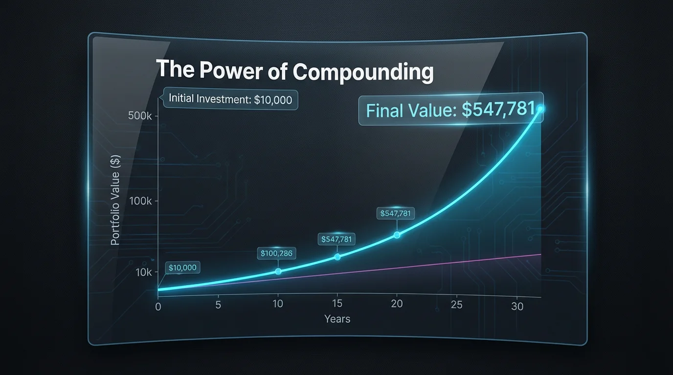
    Start by typing a clear description of the chart you want to create. For example: 'A graph showing a $1,000 investment growing at 6% annually for 30 years.'

  2. 2

    Generate Your Visualization

    Click the generate button and let the AI interpret your prompt. It will process the financial scenario and create a custom chart for you in seconds.

  3. 3

    Download Your Chart

    Your high-resolution compound interest graph is ready to download for free. Use it to enhance your presentations, reports, or personal financial plans.

Transform complex numbers into a clear, intuitive visual that tells a story. Our AI tool makes the concept of exponential growth tangible, allowing you to see how your investments can develop over time. Generate compelling charts that clearly illustrate financial projections for personal planning, educational content, or client presentations. By visualizing the data, you can gain a better understanding of your financial path. Simply describe the scenario, and watch the numbers come to life in a custom graph designed for clarity.

See Your Financial Future with AI Charts

An abstract visualization of compound interest, showing three golden trees in a row, each progressively larger and more complex than the last, symbolizing exponential growth against a clean white background.
Move beyond rigid templates and create the exact chart you envision. Our AI-powered generator offers flexibility by allowing you to specify everything through text. Describe the variables you want to compare, such as different interest rates, timeframes, or contribution amounts. You can even guide the style by requesting specific colors or chart types like bar graphs or line charts. This conversational approach to data visualization makes it simple to experiment with different scenarios and tailor the output to your specific needs.

Custom Graphs from Simple Descriptions

A visual representation of compound interest, showing four glass jars in a row on a white background. The amount of golden coins in each jar increases exponentially from left to right, with the first jar having a few coins and the last jar overflowing.
Produce high-resolution graphs perfect for any context, from business presentations and reports to personal finance blogs. Our AI tool eliminates the need for complex spreadsheet software or design skills, turning your ideas into polished visuals in just a few moments. The generated charts are crisp, clear, and ready for immediate use. This streamlined process saves you time and effort while ensuring your data is presented in an engaging and professional manner, helping you communicate financial concepts with impact.

Create Professional Financial Visuals Instantly

A conceptual visualization of compound interest, shown as a series of glowing blue bars on a white background. The bars start small on the left and grow exponentially taller to the right, illustrating accelerated growth.
It's Fast: Generate insightful financial charts in seconds, not hours. It's Flexible: Describe any scenario, from simple growth curves to complex comparisons, and the AI will build it. AI-Powered: Leverage artificial intelligence to turn financial concepts into compelling and easy-to-understand visuals. Easy to Use: No more wrestling with spreadsheets. If you can describe it, you can create it. Use Anywhere: Download high-resolution charts for personal finance blogs, school projects, or client presentations.

Why use Pixelcut's AI Compound Interest Visualization?

A 3D visualization of compound interest, featuring a glowing blue line graph that curves exponentially upward on a white background, with a small number of gold spheres at the start and a large cascade of them at the end, representing growth.
Personal Finance Planning: Visualize how your savings, retirement funds, or other investments could grow over time to make informed decisions. Educational Content: Create clear, illustrative graphs to teach students or clients about the power of compound interest. Client Presentations: Financial advisors can generate custom visuals to help clients understand potential investment strategies and outcomes. Content Creation: Enhance blog posts, articles, or social media content about finance with unique, data-driven charts. Academic Projects: Support your research on economic models or financial literacy with custom-made data visualizations.

Compound Interest Visualization Use Cases

An illustration of a small tree growing, symbolizing compound interest. A single gold coin is at its base, and the tree's leaves are replaced by many more gold coins, showing growth from a small start.

Frequently Asked Questions

Pixelcut is loved by over 2 million people

  • My favorite app

    Great app, easy to use. Helps our small business save time and money to create different marketing materials professionally. Thank you.
    Shaelyn D.
  • Best background remover

    I need a good background remover for my work and I've been through them all it feels like. This one is the best by far. It's so easy to use and the results always look amazing. Thank you Pixelcut!
    Kira H.
  • Love it

    It's amazingly easy and gives the perfect results for my bags and accessories. It looks like it was done by a professional photographer.
    Mary J.